Mastercard removes name from logo to establish digital simplicity
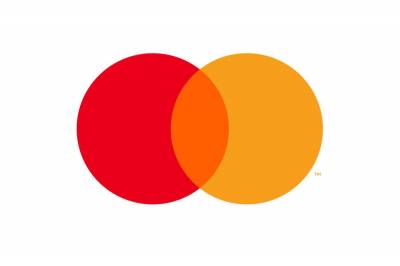
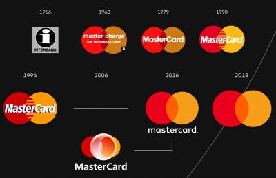
Mastercard, the brand best known for its credit cards, has removed its name from its intersecting circles logo for the first time since its 1968 creation.
The red and yellow Mastercard symbol will now stand alone without the wordmark across all digital and physical communications, including sponsorship properties and retail locations.
This will allow the mark better across digital media. The change was on the horizon back in 2017.
More than 80% of people recognize the symbol without the brand name, according to a research. The red and yellow interlocking circles have been the hallmark of the Mastercard brand for more than 50 years, symbolizing the brand’s promise to connect people to Priceless possibilities. The instantaneously recognizable circles are a powerful symbol that bring people closer to their passions and give them the confidence and trust that their transactions are secure.
Mastercard made the announcement at the Consumer Electronics Show (CES) in Las Vegas, which officially opens tomorrow (8 January).
The move sees the brand join the likes of Nike, Apple and Lacoste, which have nurtured their logos to stand alone without wordmarks. It also follows in the footsteps of Formula 1, which reworked its logo last year for the digital age.










Share
Facebook
YouTube
Tweet
Twitter
LinkedIn